Mind your reality.

Process is tightly related to concept when developing an idea. With the Tom concepts brand, a simple name is put through the physical strain that can be compared to the creative process. In order to represent my skill set of design and photographic mediums there had to be a crossover of mediums. By printing out graphics, applying dimension to them, the logo was able to have a narrative. Re capturing that process into a simple logo provides a strong message incorporating, design, dimension, and photographic qualities. The final product hints at photography and design, prompting the viewer to mind their reality.
A live preview of the Tom Concepts book
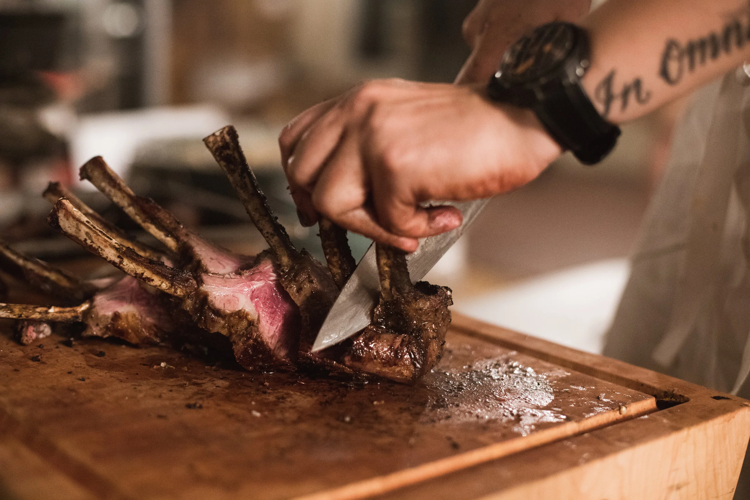
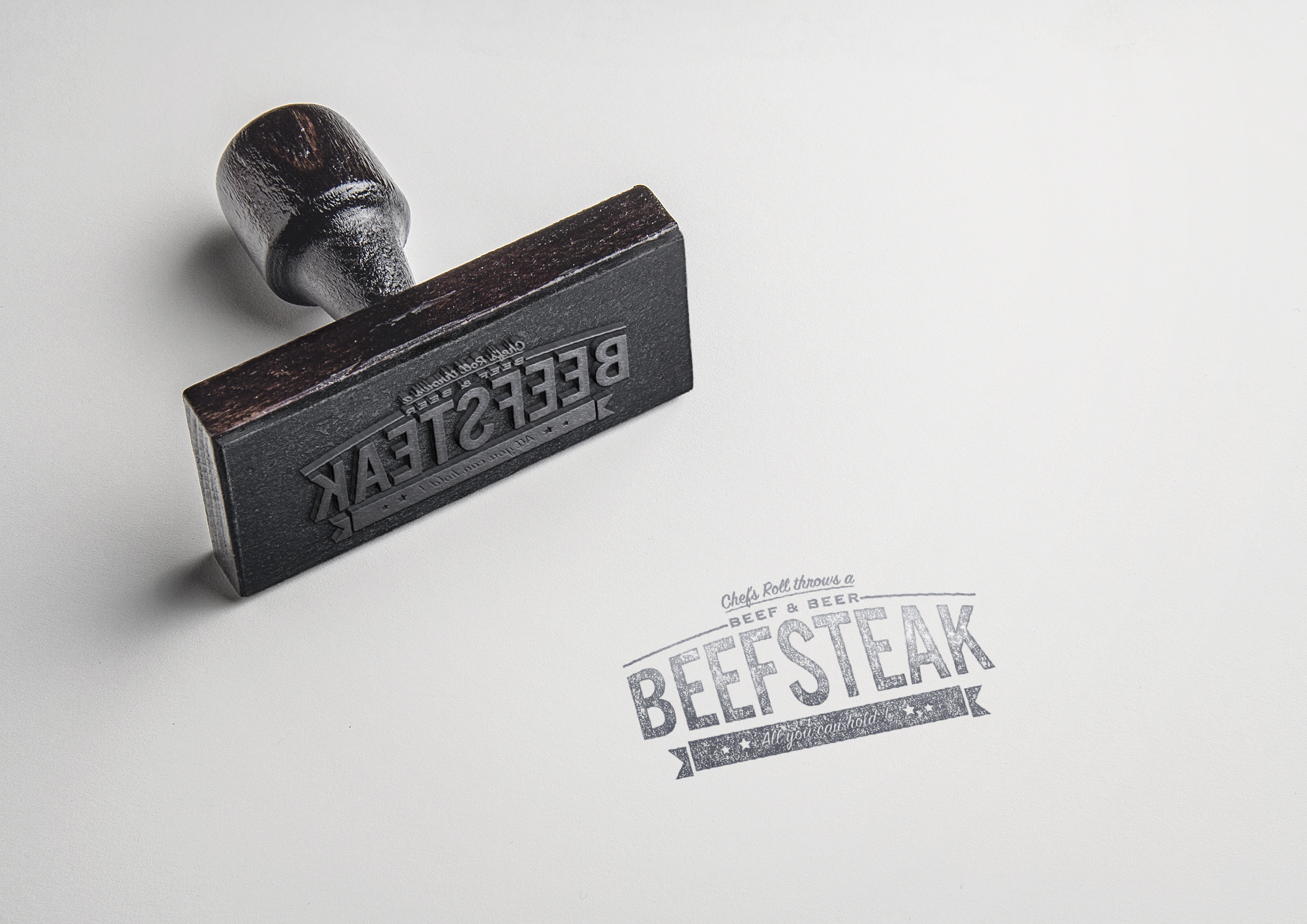
This brand identity was formed for a culinary event called the Beefsteak. The identity is used to represent an event that was once popular in 1950s New York City. The identity must be reusable for future events and sponsors.
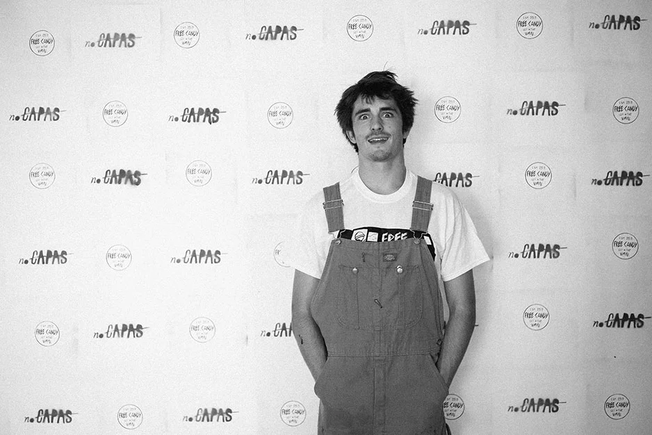
Free Candy Productions represents a movement in the youth. My generation. The name stems from the young surfer’s romanticized idea of traveling in a van in search of perfect surf. Our first video productions were comprised of our friend group’s talent and desire for expression. Van can be describe by simply as a lifestyle of adventure seeking, but the negative connotation of “free candy vans” provides a unique opportunity to change the viewers perception. Free candy represents the free original content we provide. The van is full of surf stories and culture of the youth. It is not a product or service for sale, but it is something that can be seen living in the actions of our tribe and beyond.
Started in 2013, Free Candy Productions has a long history. From a joke made in high school, to now the brand has stood the test of time. It is a brand that has grown alongside me. Free Candy Productions is as grown up as it has been, and will most likely continue on that course. It still a reflection of the youth that inspired its creation.
Conceptual photography created by two creative directions united by a W. The design challenge was to create a clean brand that evokes professionalism across multiple photography niches. By using the strong diagonals of the letterform W, a system was developed to reference frames from an SLR camera.
The elements of the brand allow for the unification of different forms of photography. The web design let’s the work come forward, with its sole purpose to organize and display. Clients can easily navigate to the niche of photography they desire.
The Senior Show is the showcase of graphic design and visual art majors work at PLNU. The poster for the event needed to represent the unveiling of hard work, and progression to another stage of life. A mix of photography and typography conveyed the storyline of growth out of the most important medium to a designer: paper.
The scale reduces the model to a symbol or icon of a PLNU student. Breaking out of two dimensions into 3d space was the indication of growth, combined with unveiling what the 2017 class had to offer for the world.
This poster series was a part of a campaign done in partnership with Point Loma Nazarene Universities sustainability department. The goal was to combine stark facts with playful figures. There is a playful balance between dark subject matter and light aesthetic/color.
Illustrations by: Courtney Dobbins
GLDR Hand planes was a brand that needed to communicate high class craftsmanship for a simple lifestyle. These hand planes are built from broken surfboards, custom shaped and hand glassed.
Logo Design
Communicating the warm hearted hand woven aspect with a modern twist to appeal to the young surf culture.
Visualizing avant garde technology is the design challenge. We wanted to come up with a form of augmented reality that would tap into the imagination of the viewer.
Elysse is a hypothetical hardware and software that allows the user to increase productivity through multitasking. One of the problems with a phone or a laptop is limited screen space. With these glasses, users would be able fix this problem in a stylish way. Elysse Optics extends existing software into 3d space allowing the user to use gesture based interface to control content through swipes and depth.
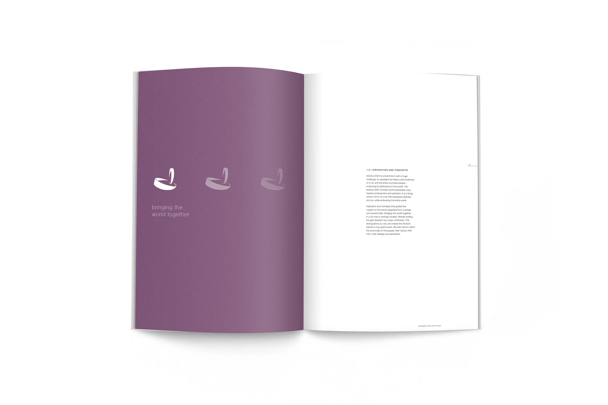
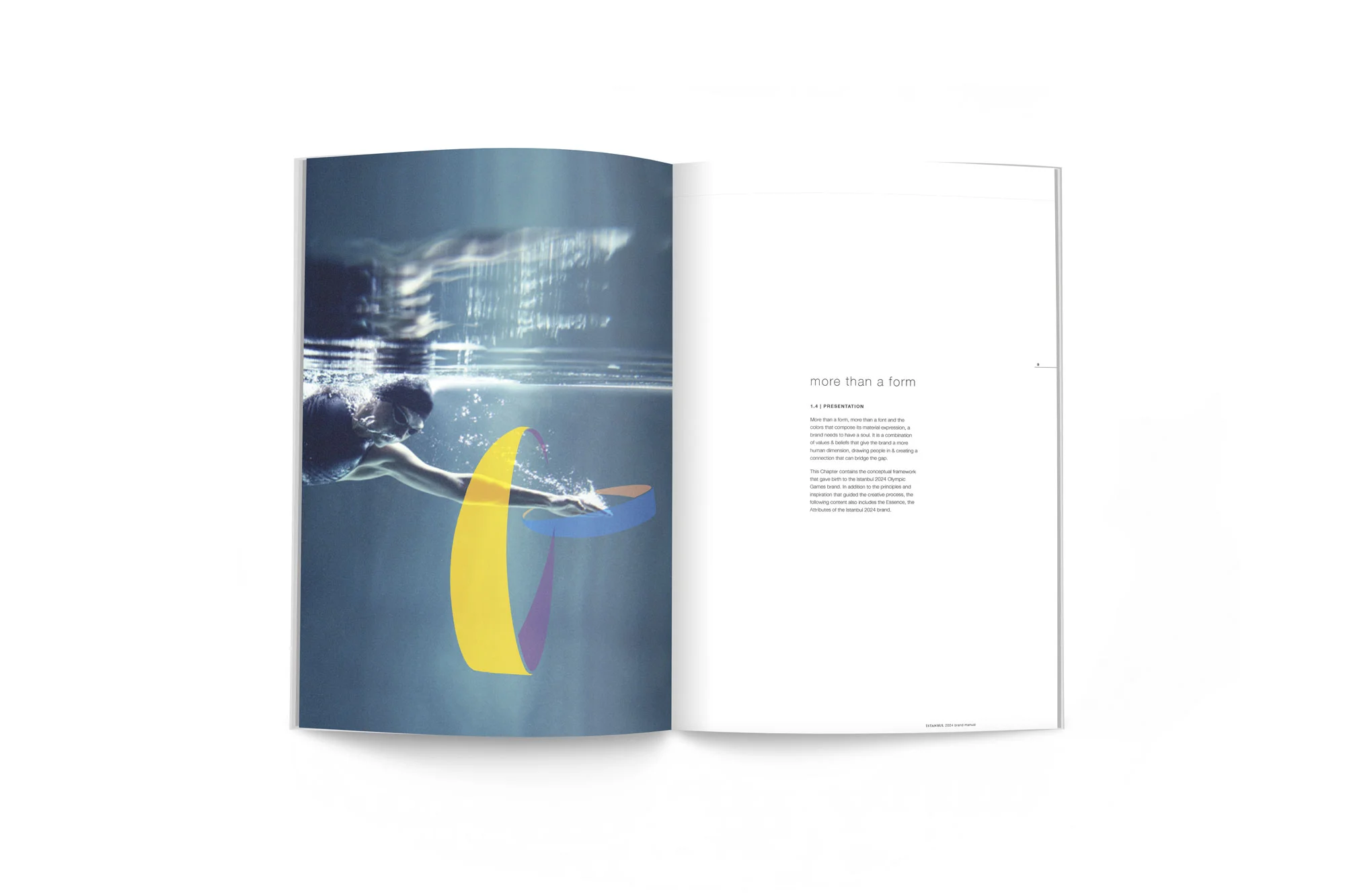
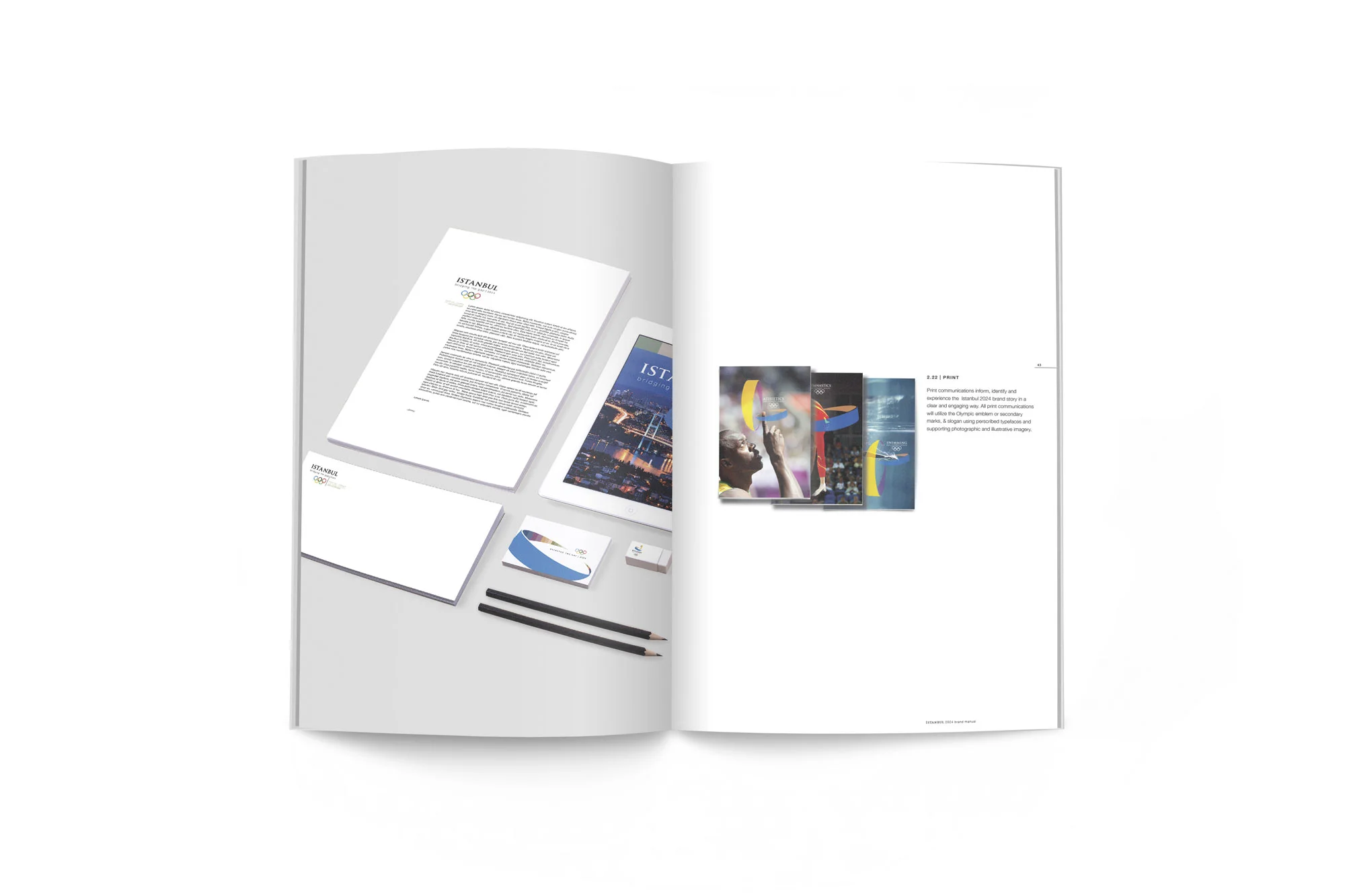
Istanbul was a potential host for the 2024 summer Olympics. As a mock project the client was the city of Istanbul marketing itself as an olympic city. In order to gain an understanding of Istanbul from an outsiders perspective the research process was extensive. Out of this process Three major concepts stuck out, location, art, and nationality. Istanbul is located right in the middle of two cultures physically being a bridge between western and eastern culture. Street art and vibrant colors, are a staple in the modern cities. The unique symbol in the national flag offered a starting point for a form that would represent the brand and nation itself. “Bridging the Gap” references the unification of people, the physical location of Istanbul on the Bosphorus river, and the mosaic of colors found in local street art.
Rush is a durable, bold, modern company breaking into the sports utility industry. It aspires to provide explorers with quality backpacks that exceed consumers current opinions on what a backpack is capable of. Not only are Rush’s backpacks waterproof, they are also stylish, fair trade, and durable. Rush has one product: waterproof backpacks.
This hypothetical client needed a logo that was competitive with current outdoor enthusiest brands. Simple and fast, Rush embodied the modern outdoor adventurer. Photo mockups of the actual product were provided in an extensive marketing plan.
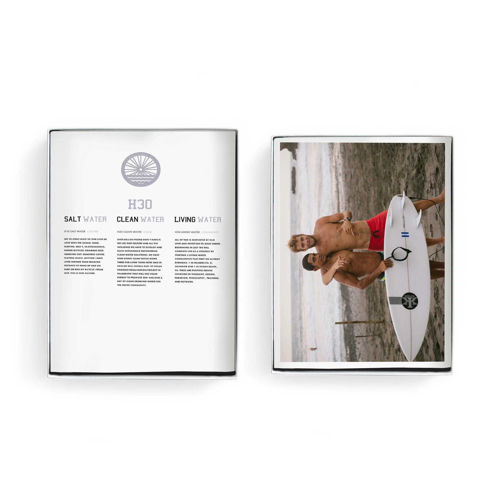
Ride 4 Water gives a platform for people to do good while seeing the world. Crowdfunding missions trips and building community is the goal. I joined Ride4Water in the Spring of 2017 on a trip to El Salvador. On the trip it was my goal to use my vocation for the most good. Using connections I have in the surf industry/surf world, and passion for photography we were able to do the most good at our place in life. We were able to donate eight brand new Raynor surfboards to the local surf community. They came with a custom El Salvadorian flag lamination that gets glassed into the surfboard. It displays their mantra: Al Suave.
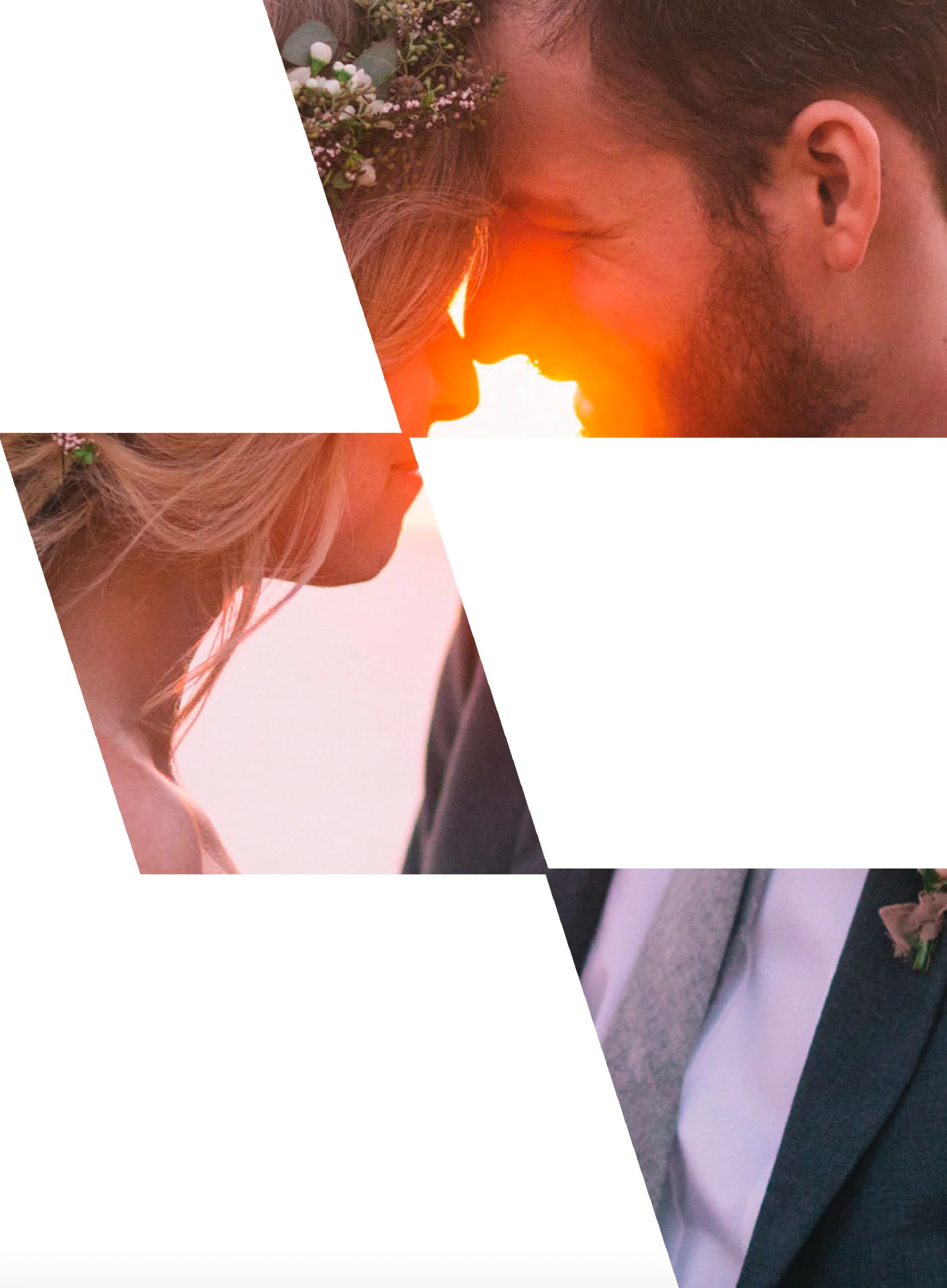
Photography taken on this trip was donated to Ride 4 Water to increase quality contact allowing them to tell their brand story in a thought provoking and professional way. I extended this opportunity for visual story telling by designing a piece of collateral for individuals who have donated to the cause. It focuses on the H3O mission and uses moments in time from specific trips that embody that mission.